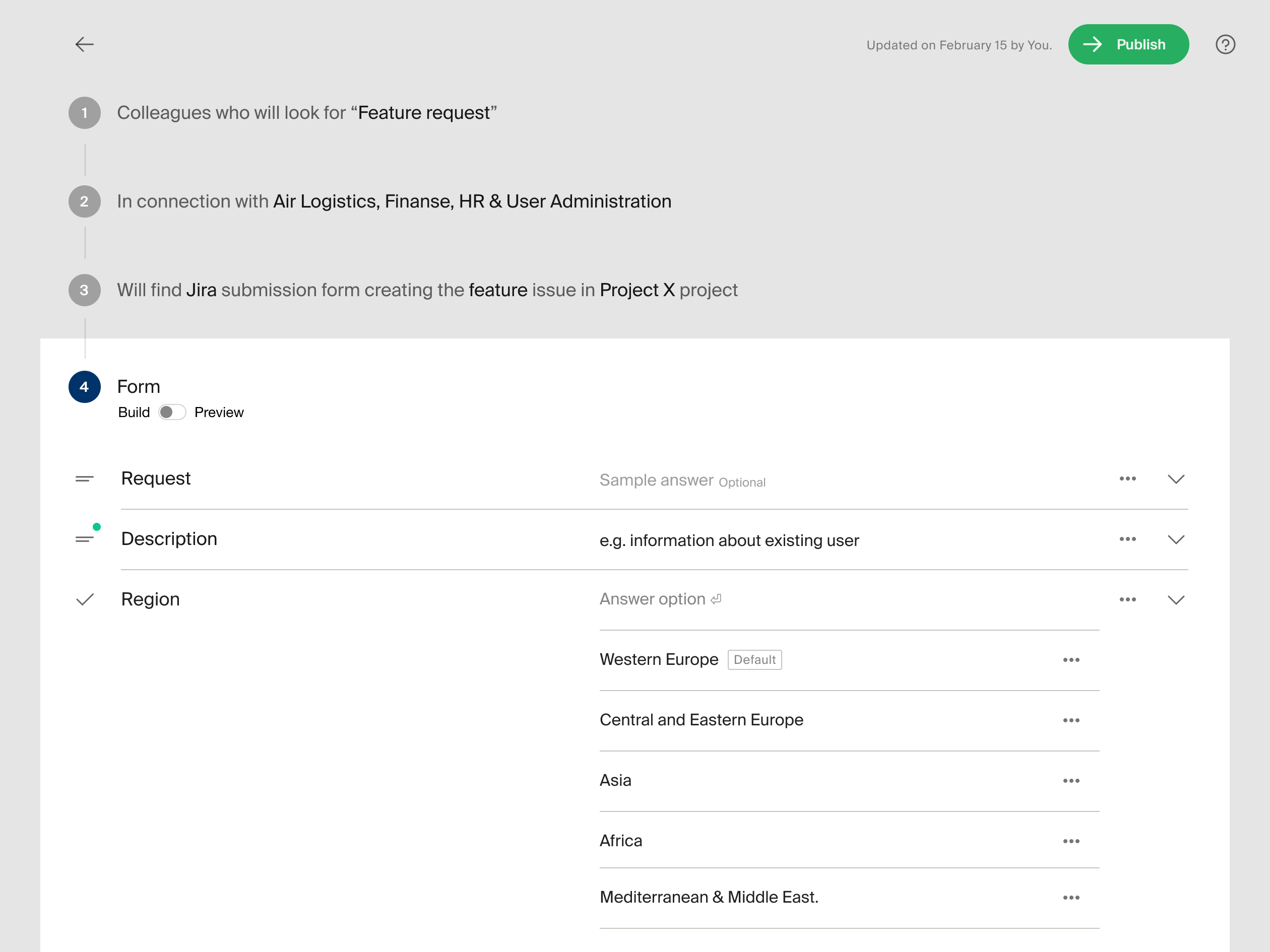
Problems solved
Make sure the resulting forms are good 🙄
Good forms are notoriously tricky to implement. Our goal was to design this process in a way that doesn't require the know-how on the user’s part.
Help people creating forms think in user-centric terms
In addition to the intricacies of form design, it was crucial to make the form creators see their users' perspective. Embedded user-centeredness!
Ensure discoverability
Navigation had to support all the variety of things and concepts that can be found in a large multinational organisation.
Reducing the load on support agents
Support can be one of the largest budget items, especially when they operate on a global scale. Form builder helps to shrink that cost by improving agent velocity—and in turn, creating happier employees.
Who we designed for

Support1 agent, formcreator
Are responsible for creating, sustaining and improving a particular process, as well as, being responsible for the outcomes of the process. They need a way to manage incoming requests.

Employee, end-user of the form
Has a task and needs support in achieving it. Can be a person or a group's representative. In order to get support, they need to find the right way to get it.
Design highlights
Strategic reframe: From data collection to user assistance
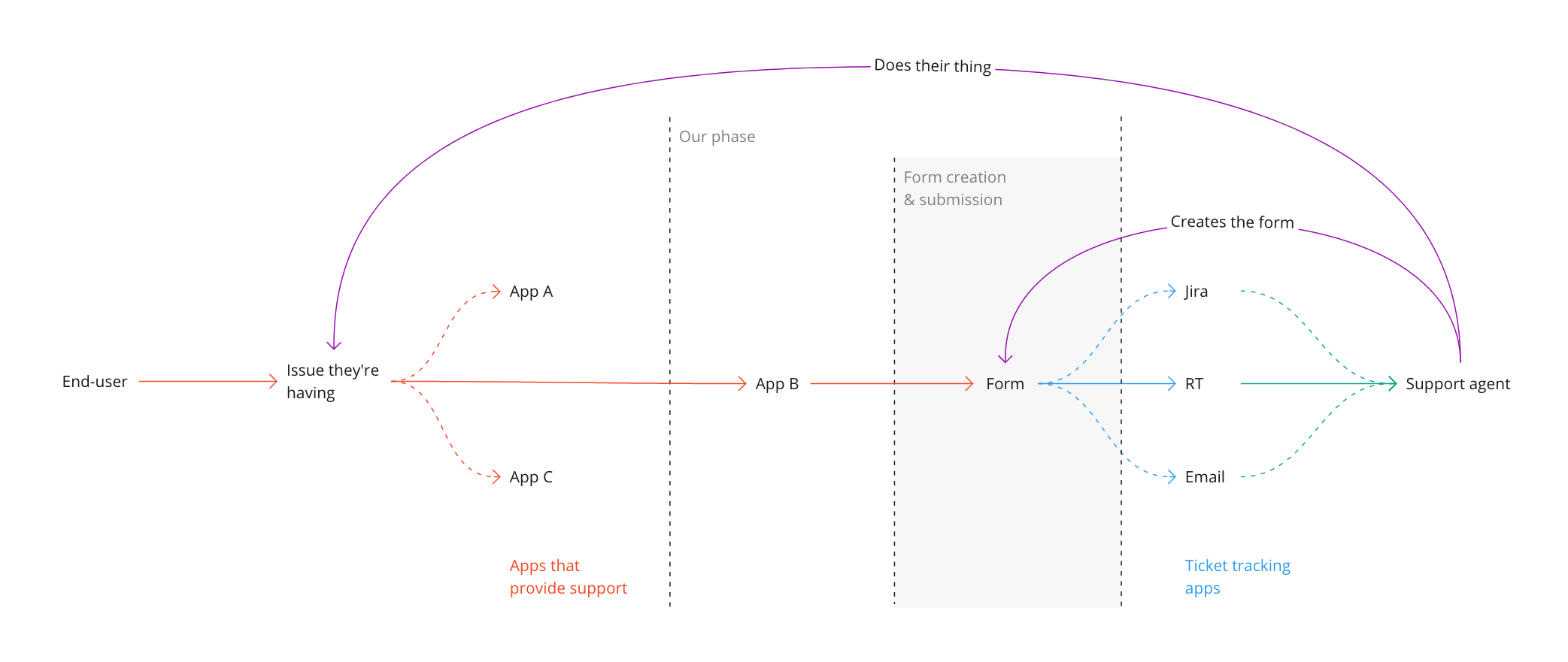
The application of which the builder is a part of is only a phase in the more general journey people in the company embark on when they need support with something. Acknowledgement of this by the team was important for a better understanding of where our users come from and what happens after they fill out their forms.
We built our team's understanding of the territory by mapping out the broader context. That helped achieve clarity and alignment around goals for the project, expectations, and potential dependencies and concerns. Stakeholder interviews further developed & broadened this understanding.
Ensuring discoverability
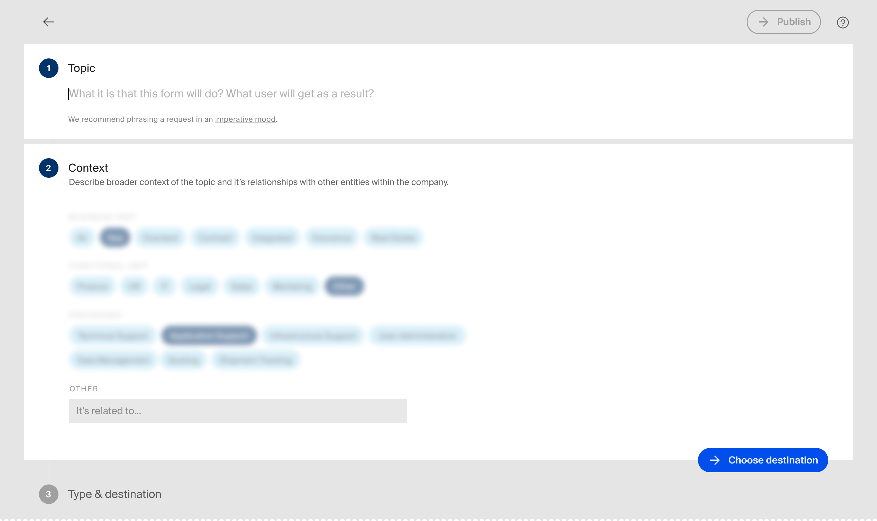
Finding the right form was one of the biggest pain points for the previous reincarnation of the app and our goal was to make it easier to do. To achieve this we needed to make sure our users name and organize their forms in a way that their respective users can relate to.
The job of defining the topic of the form is divided between its title and the combination of tags. There are two parts to the form's definition: the immediate "topic" at hand and the broader "subject" space within which the process takes place. E.g. in "new user in HR system" the "new user" will be a topic and the "HR system" – its context that distinguishes it from other forms dedicated to the creation of users. It was important to build our search to understand different combinations between the two.2
By prompting creators with "What will users search for?" instead of "Name your form", we shifted their mindset from organisation to discovery.
Making forms automatically well-designed
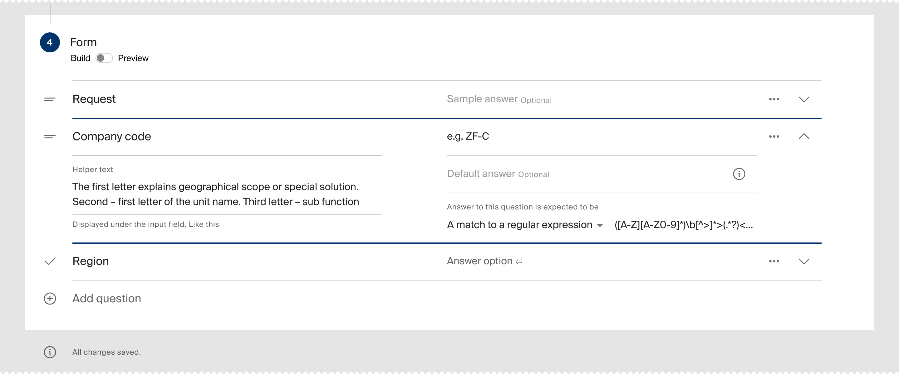
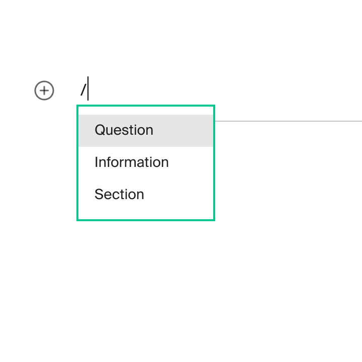
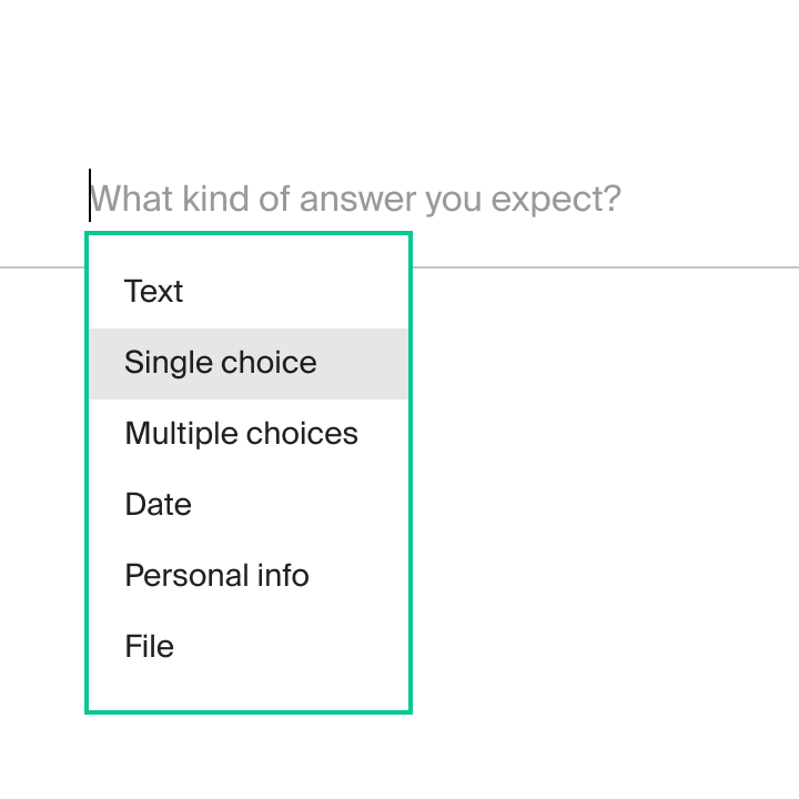
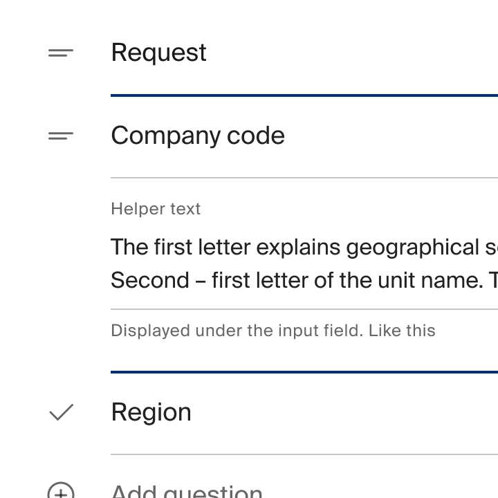
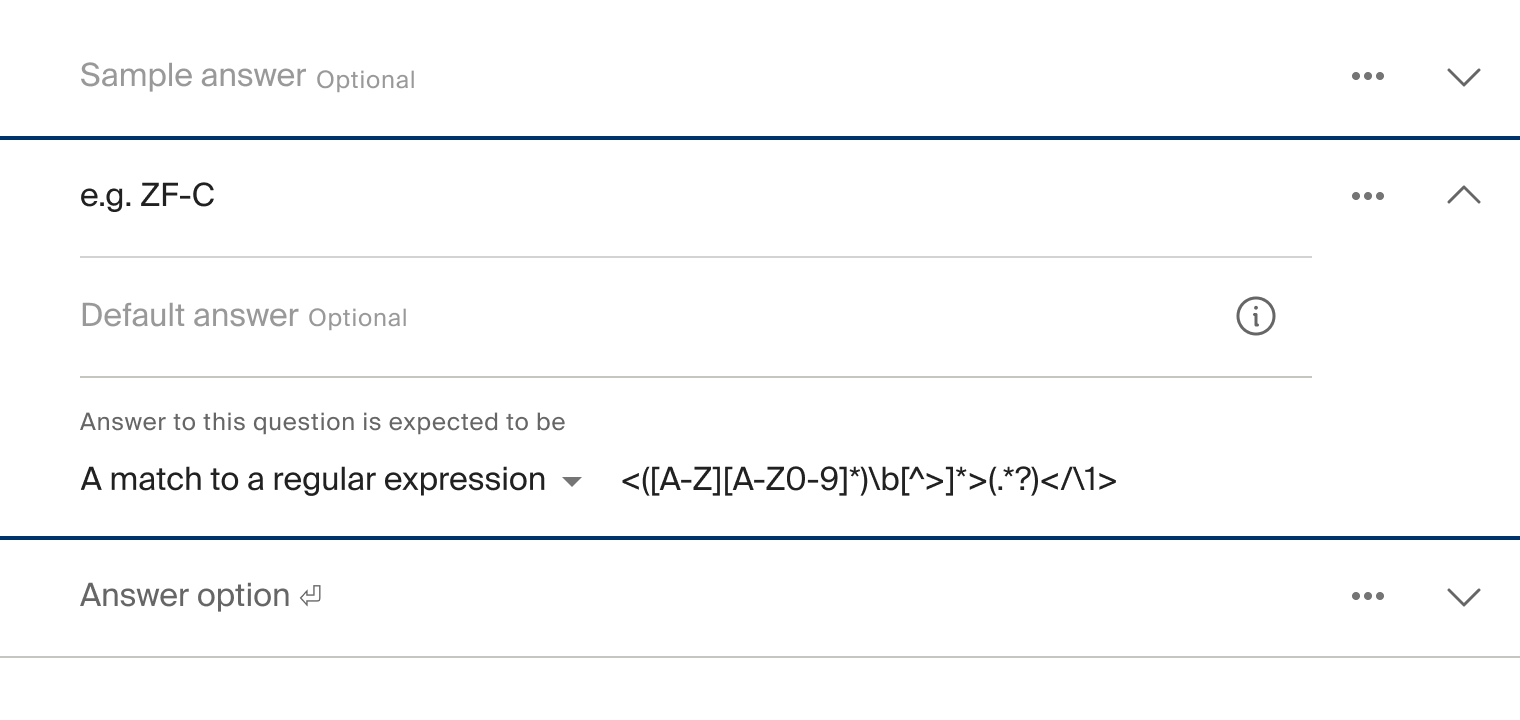
When non-designers create forms, there's an opportunity to guide them towards clearer labels, better help text, and more useful error messages through progressive disclosure with embedded best practices.
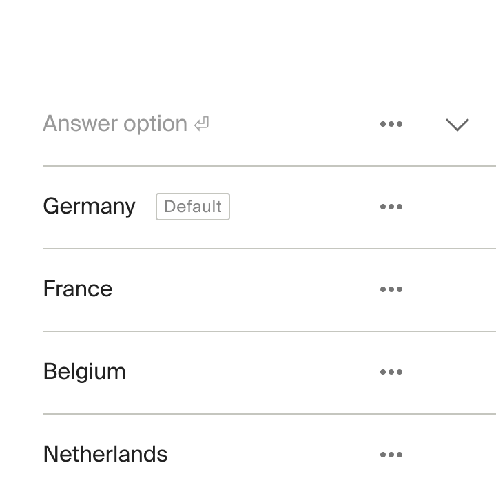
Simple forms stay simple. Complex forms reveal options progressively. Every component automatically includes proper labels, clear help text, and user-friendly validation.
Roadmap planning
I participated in the product roadmap planning cycle by highlighting user needs and the state of the team’s current response to those needs: gaps, opportunities, and blindspots. Helped team members frame their work around the problems that need to be solved rather than the specific features they want to build.
Kano modelling was used for prioritisation of new features. Being limited in resources, our focus was on serving our users' basic expectations, to make sure there’s nothing they’re missing. Still, I was always on the lookout for inexpensive ways to add a moment of delight.
Outcomes
for support agents
The new interface improved the overall experience and user satisfaction. User feedback & data we gathered confirmed improved usability.
for the rest of the employees
Metrics and feedback tells a pretty good story - most users find the form right away on their first try. Looking at how quickly they fill it out and how few mistakes they make, it seems like they're breezing through without much trouble or frustration.
